 Flex布局
Flex 布局
Flexbox 布局介绍
w3.org : CSS Flexible Box Layout Module Level 1 (opens new window)
简单实用
未启用 flex 布局时的代码:
<head>
  <meta charset="UTF-8" />
  <title>position details</title>
  <style>
    * {
      margin: 0px;
      padding: 0px;
    }

    .container {
      width: 1200px;
      margin: 0 auto;
      background-color: #eee;
    }

    .box {
      height: 30px;
      font-size: 20px;
      width: 30px;
    }

    .box1 {
      background: #bdc3cc;
    }

    .box2 {
      background: #2eccaa;
    }

    .box3 {
      background: #169045;
    }

    .box4 {
      background: #34ff66;
    }

    .box5 {
      background: #f1c400;
    }

    .box6 {
      background: #e67e22;
    }

    .box7 {
      background: #e74ccc;
    }

    .box8 {
      background: #1abcff;
    }

    .box9 {
      background: #3498dd;
    }

    .box10 {
      background: #9b59bb;
    }
  </style>
</head>

<body>
  <div class="container">
    <div class="box box1">1</div>
    <div class="box box2">2</div>
    <div class="box box3">3</div>
    <div class="box box4">4</div>
    <div class="box box5">5</div>
    <div class="box box6">6</div>
    <div class="box box7">7</div>
    <div class="box box8">8</div>
    <div class="box box9">9</div>
    <div class="box box10">10</div>
  </div>
</body>
2
3
4
5
6
7
8
9
10
11
12
13
14
15
16
17
18
19
20
21
22
23
24
25
26
27
28
29
30
31
32
33
34
35
36
37
38
39
40
41
42
43
44
45
46
47
48
49
50
51
52
53
54
55
56
57
58
59
60
61
62
63
64
65
66
67
68
69
70
71
72
73
74
75
76
77
效果如下:

启用 flex 布局
/*其他内容基于上一节代码*/
.container {
  width: 1200px;
  margin: 0 auto;
  background-color: #eee;
  display: flex;
}
2
3
4
5
6
7
效果如下:

配合 justify-content: center; 实现水平居中
/*其他内容基于上一节代码*/
.container {
  width: 1200px;
  margin: 0 auto;
  background-color: #eee;
  display: flex;
  justify-content: center;
}
2
3
4
5
6
7
8
效果如下:

flex-direction 调整排列方式
/*其他内容基于上一节代码*/ .container { width: 1200px; margin: 0 auto; background-color: #eee;
display: flex; justify-content: center; flex-direction: column; }
2
效果如下:

通过 order 调整显示顺序
/*其他内容基于上一节代码*/
.box3 {
  /* order 默认为0,小值优先摆放 */
  order: -1;
  background: #169045;
}
2
3
4
5
6
效果如下:

轴
采用 Flex 布局的元素,称为 Flex 容器(flex container),简称”==容器==”。它的所有子元素自动成为容器成员,称为 Flex 项目(flex item),简称”==项目==”。

轴 即元素的排列方向。当元素从左向右排列时,主轴即水平方向线,与之垂直交叉的称为侧轴;当元素从上向下排列时,主轴即为垂直方向线,水平方向线则为侧轴。
轴可以通过 flex-direction 设置, 默认从左往右。
行
基于 4.8.1 的最终效果,我们再设置 flex-wrap ,此时内容就可以换行显示:
/* 基于 4.8.1 的最终效果 */
.container {
  width: 120px;
  margin: 0 auto;
  background-color: #eee;
  display: flex;
  justify-content: center;
  /* flex-direction: column; */
  flex-wrap: wrap;
}
2
3
4
5
6
7
8
9
10
效果如下:

如上图,界面中的内容产生了换行,每一行都称为 flex line ,即 flex 行。
如果我们把代码修改成下面的样子:
.container {
  height: 120px;
  margin: 0 auto;
  background-color: #eee;
  display: flex;
  justify-content: center;
  flex-direction: column;
  flex-wrap: wrap;
}
2
3
4
5
6
7
8
9
效果如下:

由于上述代码中指定了 flex-direction:column 也就是垂直排列,并且指定了 flex-wrap: wrap; , 所以就会以列的形式显示内容。这里的列也被称为 flex line,即 flex 行。
也就是说,flex 受 flex-direction 影响,flex 行的方向与 flex-driection 的方向一致
flex container 和 flex item
声明了 display:flex 的容器就称为 flex container, 该容器内的子元素就称为 flex item
Flexbox 相关属性详解
参考:A Complete Guide to Flexbox (opens new window)
flex container 的属性

display
.container {
  display: flex; /* or inline-flex */
}
2
3
flex-direction 轴向

.container {
  flex-direction: row | row-reverse | column | column-reverse;
}

row(默认值):主轴为水平方向,起点在左端。
row-reverse:主轴为水平方向,起点在右端。
column:主轴为垂直方向,起点在上沿。
column-reverse:主轴为垂直方向,起点在下沿。
2
3
4
5
6
7
8
flex-wrap 自动换行

.container {
  flex-wrap: nowrap | wrap | wrap-reverse;
}
2
3

flex-flow
是 flex-direction 和 flex-wrap 二者的简写,同时定义了主轴和交叉轴(测轴),默认取值 row nowrap
.container {
  /* 前面设置 flex-dircetion 的取值,后面设置 flex-wrap 的取值 */
  flex-flow: <‘flex-direction’> || <‘flex-wrap’>;
}
2
3
4
.container {
  flex-flow: column wrap;
}
2
3
justify-content
justify-content 属性定义了项目在==主轴==上的对齐方式。
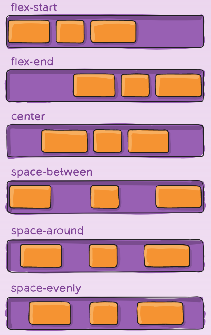
.container {
  justify-content: flex-start | flex-end | center | space-between | space-around | space-evenly | start | end | left | right ... + safe | unsafe;
}

flex-start(默认值):左对齐
flex-end:右对齐
center: 居中
space-between:两端对齐,项目之间的间隔都相等。
space-around:每个项目两侧的间隔相等。所以,项目之间的间隔比项目与边框的间隔大一倍
2
3
4
5
6
7
8
9
align-items
align-items 属性定义项目在==交叉轴==上如何对齐

.container {
  align-items: stretch | flex-start | flex-end | center | baseline | first baseline | last baseline | start | end | self-start | self-end + ... safe | unsafe;
}

flex-start:交叉轴的起点对齐。
flex-end:交叉轴的终点对齐。
center:交叉轴的中点对齐。
baseline: 项目的第一行文字的基线对齐。
stretch(默认值):如果项目未设置高度或设为auto,将占满整个容器的高度。
2
3
4
5
6
7
8
9
align-content
align-content 属性定义了多根轴线的对齐方式。如果项目只有一根轴线,该属性不起作用。

.container {
  align-content: flex-start | flex-end | center | space-between | space-around | space-evenly | stretch | start | end | baseline | first baseline | last baseline + ... safe | unsafe;
}
flex-start:与交叉轴的起点对齐。
flex-end:与交叉轴的终点对齐。
center:与交叉轴的中点对齐。
space-between:与交叉轴两端对齐,轴线之间的间隔平均分布。
space-around:每根轴线两侧的间隔都相等。所以,轴线之间的间隔比轴线与边框的间隔大一倍。
stretch(默认值):轴线占满整个交叉轴。
2
3
4
5
6
7
8
9
<head>
  <meta charset="UTF-8" />
  <title>position details</title>
  <style>
    * {
      margin: 0px;
      padding: 0px;
    }
    /* 基于 4.8.1 的最终效果 */

    .container {
      width: 120px;
      height: 200px;
      margin: 0 auto;
      background-color: #eee;
      display: flex;
      justify-content: center;
      flex-direction: row;
      align-content: flex-end;
      flex-wrap: wrap;
    }

    .box {
      /* height: 30px; */
      font-size: 20px;
      width: 30px;
    }

    .box1 {
      background: #bdc3cc;
    }

    .box2 {
      background: #2eccaa;
    }

    .box3 {
      /* order */
      order: -1;
      background: #169045;
    }

    .box4 {
      background: #34ff66;
    }

    .box5 {
      background: #f1c400;
    }

    .box6 {
      background: #e67e22;
    }

    .box7 {
      background: #e74ccc;
      flex-shrink: 2;
    }

    .box8 {
      background: #1abcff;
      flex-shrink: 4;
    }

    .box9 {
      background: #3498dd;
    }

    .box10 {
      background: #9b59bb;
    }
  </style>
</head>

<body>
  <div class="container">
    <div class="box box1">1</div>
    <div class="box box2">2</div>
    <div class="box box3">3</div>
    <div class="box box4">4</div>
    <div class="box box5">5</div>
    <div class="box box6">6</div>
    <div class="box box7">7</div>
    <div class="box box8">8</div>
    <div class="box box9">9</div>
    <div class="box box10">10</div>
  </div>
</body>
2
3
4
5
6
7
8
9
10
11
12
13
14
15
16
17
18
19
20
21
22
23
24
25
26
27
28
29
30
31
32
33
34
35
36
37
38
39
40
41
42
43
44
45
46
47
48
49
50
51
52
53
54
55
56
57
58
59
60
61
62
63
64
65
66
67
68
69
70
71
72
73
74
75
76
77
78
79
80
81
82
83
84
85
86
87
88
效果如下:


项目的属性
- order
- flex-grow
- flex-shrink
- flex-basis
- flex
- align-self
order

默认情况下,flex 容器中的 items 是按照源码中的书写顺序进行排列的。但是,通过 order 属性我们可以改变这些条目的显示顺序。
默认情况下,每个条目的 order 取值为 0,取值小的优先显示,取值大的后显示。
.item {
  order: 5; /* default is 0 */
}
2
3
flex-grow
flex-grow 属性定义项目的放大比例,默认为 0,即如果存在剩余空间,也不放大。

.item {
  flex-grow: 4; /* default 0 */
}
2
3
取值为正数,负数无效,默认值为 0,不带单位,表示一个比例。
当条目内容不足以填满容器时,
- 如果我们为某个条目设置了
flex-grow, 则该条目会占满剩余空间。 - 如果我们同时为多个条目设置了
flex-grow, 则会按照其值进行分配。如:条目 1 设置的flex-grow为 2,条目 2 设置的flex-grow为 3,那么,条目 1 会占据容器的 2/5,条目 2 会占据容器的 3/5。
flex-shrink
flex-shrink 属性定义了项目的缩小比例,默认为 1,即如果空间不足,该项目将缩小。
.item {
  flex-shrink: 3; /* default 1 */
}
2
3

如果所有项目的 flex-shrink 属性都为 1,当空间不足时,都将等比例缩小。如果一个项目的 flex-shrink 属性为 0,其他项目都为 1,则空间不足时,前者不缩小。负值对该属性无效。
flex-basis
flex-basis 属性定义了在分配多余空间之前,项目占据的主轴空间(main size)。浏览器根据这个属性,计算主轴是否有多余空间。它的默认值为 auto,即项目的本来大小。
.item {
  flex-basis: | auto; /* default auto */
}
2
3
它可以设为跟 width 或 height 属性一样的值(比如 350px),则项目将占据固定空间。
flex
flex 属性是 flex-grow, flex-shrink 和 flex-basis 的简写,默认值为 0 1 auto。后两个属性可选。
.item {
  flex: none | [ < 'flex-grow' > < 'flex-shrink' >? || < 'flex-basis' > ];
}
2
3
该属性有两个快捷值:auto (1 1 auto) 和 none (0 0 auto)。
建议优先使用这个属性,而不是单独写三个分离的属性,因为浏览器会推算相关值。
align-self
align-self 属性允许单个项目有与其他项目不一样的对齐方式,可覆盖 align-items 属性。默认值为 auto,表示继承父元素的 align-items 属性,如果没有父元素,则等同于 stretch。

.item {
  align-self: auto | flex-start | flex-end | center | baseline | stretch;
}
2
3
该属性可能取 6 个值,除了 auto,其他都与 align-items 属性完全一致。
Flexbox 应用 demo
让子元素始终位于父元素的正中心
基于定位实现
<head>
  <meta charset="UTF-8" />
  <title>position details</title>
  <style>
    * {
      margin: 0px;
      padding: 0px;
    }

    .container {
      width: 320px;
      /* 让元素与视窗高度保持一致 */
      height: 100vh;
      background-color: #eee;
      position: relative;
    }

    .box1 {
      background: aquamarine;
      width: 60px;
      height: 60px;
      position: absolute;
      /* 水平方向左上角起点居中 */
      left: 50%;
      /* 垂直方向上左上角起点居中 */
      top: 50%;
      /* 上移 1/2 视图高度 */
      margin-top: -30px;
      /* 左移 1/2 视图高度 */
      margin-left: -30px;
    }
  </style>
</head>

<body>
  <div class="container">
    <div class="box1">1</div>
  </div>
</body>
2
3
4
5
6
7
8
9
10
11
12
13
14
15
16
17
18
19
20
21
22
23
24
25
26
27
28
29
30
31
32
33
34
35
36
37
38
39
基于 flex 实现
<head>
  <meta charset="UTF-8" />
  <title>position details</title>
  <style>
    * {
      margin: 0px;
      padding: 0px;
    }

    .container {
      width: 320px;
      /* 让元素与视窗高度保持一致 */
      height: 100vh;
      background-color: #eee;
      display: flex;
      justify-content: center;
      align-items: center;
    }

    .box1 {
      background: aquamarine;
      width: 60px;
      height: 60px;
    }
  </style>
</head>

<body>
  <div class="container">
    <div class="box1">1</div>
  </div>
</body>
2
3
4
5
6
7
8
9
10
11
12
13
14
15
16
17
18
19
20
21
22
23
24
25
26
27
28
29
30
31
32
效果如下:


基于定位的方式不灵活,会随着子元素宽高的变化而修改代码。flex 方式灵活,不需要关心子元素的宽高情况。
实现子元素的等高等宽排列
注意:此处代码有问题,未能实现视频中等宽等高的效果,暂时不确定问题出在哪里。😢 下面的示例只是其中的部分代码
<head>
  <meta charset="UTF-8" />
  <title>position details</title>
  <style>
    body {
      margin: 0px;
    }

    header {
      background: #c3a;
      height: 50px;
    }

    h2 {
      text-align: center;
      color: #fff;
      line-height: 50px;
      margin: 0;
    }

    section {
      display: flex;
      flex-wrap: wrap;
    }

    article {
      width: 200px;
      background: #ffc;
      margin: 10px;
      padding: 10px;
    }

    p {
      word-break: normal;
    }
  </style>
</head>

<body>
  <header>
    <h2>flexbox example</h2>
  </header>
  <section>
    <article>
      <h3>1111111</h3>
      <p>aaaaaaaaaaaaaaaaaaaaaaaaaaaaaaaaaaaaaaaaaaaaaaaaaaaaaaaa</p>
    </article>
    <article>
      <h3>2222222</h3>
      <p>
        bbbbbbbbbbbbbbbbbbbbbbbbbbbbbbbbbbbbbbbbbbbbbbbbbbbbbbbbbbbbbbbbbbbbbbbbbbbbbbbbbbbbbbbbbbbbbbbbbbbbbbbbbbbbbbbbbbbbbbbbbbbbbbbbbbbbbbbbbbbbbbbbbbbbbbbbbbbbbbbbbbbbbbbbbbbbbb
      </p>
    </article>
    <article>
      <h3>33333333</h3>
      <p>ccccccccccccccccccccccccccccccccccccccccccccccccccccccc</p>
    </article>
  </section>
</body>
2
3
4
5
6
7
8
9
10
11
12
13
14
15
16
17
18
19
20
21
22
23
24
25
26
27
28
29
30
31
32
33
34
35
36
37
38
39
40
41
42
43
44
45
46
47
48
49
50
51
52
53
54
55
56
57
58
59
Flexbox 兼容性
兼容性
在 caniuse 网站中查看 flexbox 的兼容性 (opens new window)

厂商前缀
厂商前缀的作用是,不同属性在不同厂商的浏览器中写法可能会有差异,通过下面的这个网站可以查看一个属性在不同浏览器中的写法, 从而实现兼容。
[需要翻墙:http://autoprefixer.github.io/](